

Logo
One mark,
many forms.
The shortest expression of the brand. Use it confidently, sparingly, and always with enough air around it.
Primary
Mono only — no colour version. Black on light, neutral backgrounds. White on everything else: black, navy, Signal, or any mid-tone colour such as red, amber, or saturated greens. If the surface has any real colour to it, use white.
Halo
Only use the halo when space doesn't allow the full lockup.
Avatars, favicons, app icons, loading states, tight UI — nowhere else. The wordmark is always preferred when it fits. Same rule as the lockup: black on light, white on dark or coloured.

Over media
Over photography and video, the mark is always white and always centred — no exceptions, regardless of whether the scene is dark or bright. Never use the black version on imagery. Keep generous clear space so the mark breathes.

On dark imagery
White logo, centred. Always white over photography.

On light imagery
Still white — even on bright scenes. Never black over a photo.

Video / motion
White, centred, with a subtle recording indicator.
Social / square
Halo on navy for profile avatars, Instagram, LinkedIn.
Over media — misuse
A few common mistakes that break the rule above. Contrast, version and clear space matter as much on a photo as they do on a flat surface.

Don't skip clear space
Pushed against an edge, the mark loses presence.
Don't use the black version on imagery
Over any photo, it should always be the white version.
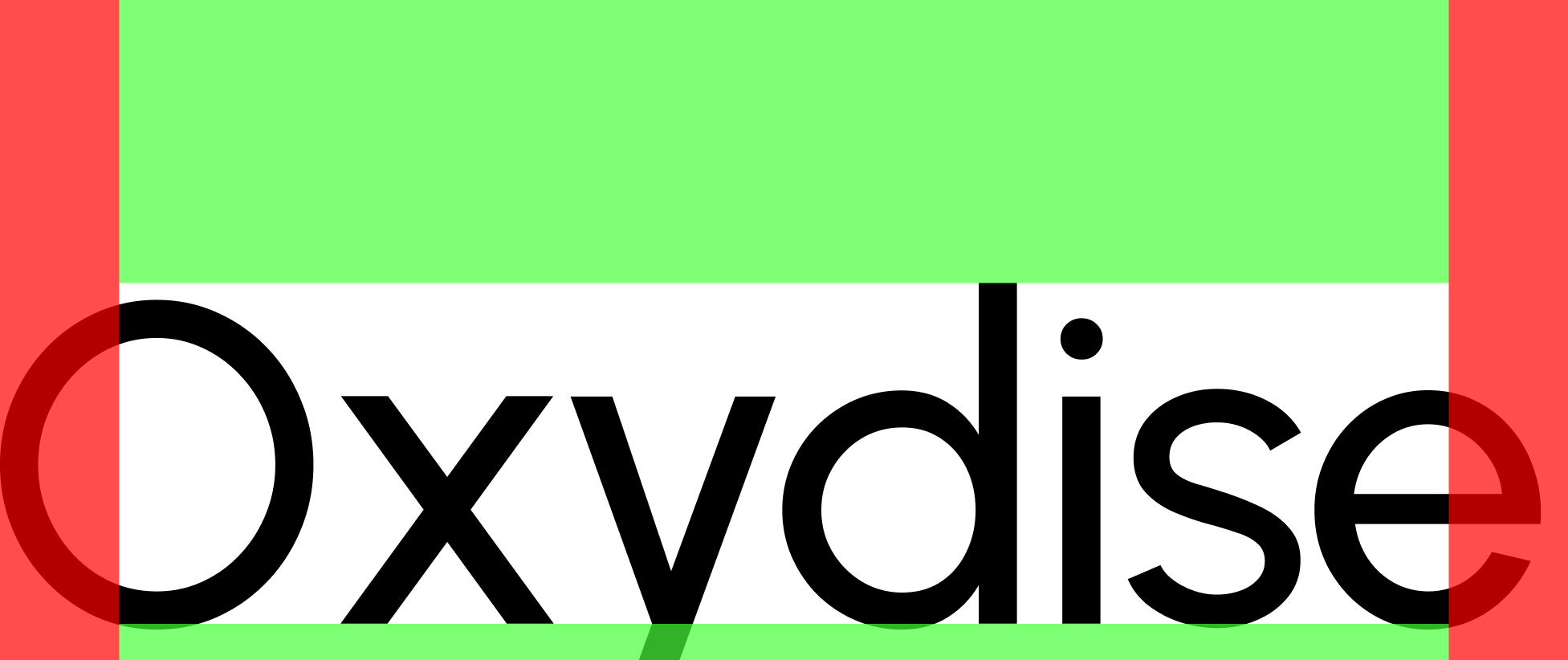
Clear space
Keep at least the height of the wordmark as clear space on every side. Nothing lives inside that zone — not type, not edges, not other marks.
Misuse
The logo is a system, not a sticker. Don't recolour, stretch, outline, or rotate.
Don't stretch
Don't rotate
Don't recolour
Don't add effects
Crop misuse
Side crops are allowed when the layout calls for it (see the next section), but the top of the lockup is sacred and bottom crops should stay minimal. Anything that cuts into the wordmark or breaks the balance is off-limits.
Don't crop the top
Don't crop deep at the bottom
Don't crop into the letters
Don't crop a corner
The only way to crop
Never crop the top of the Oxydise logo. Side cropping is permitted when required, with minimal cropping allowed at the bottom. Ensure the logo remains clear, balanced, and fully legible at all times.
In practice
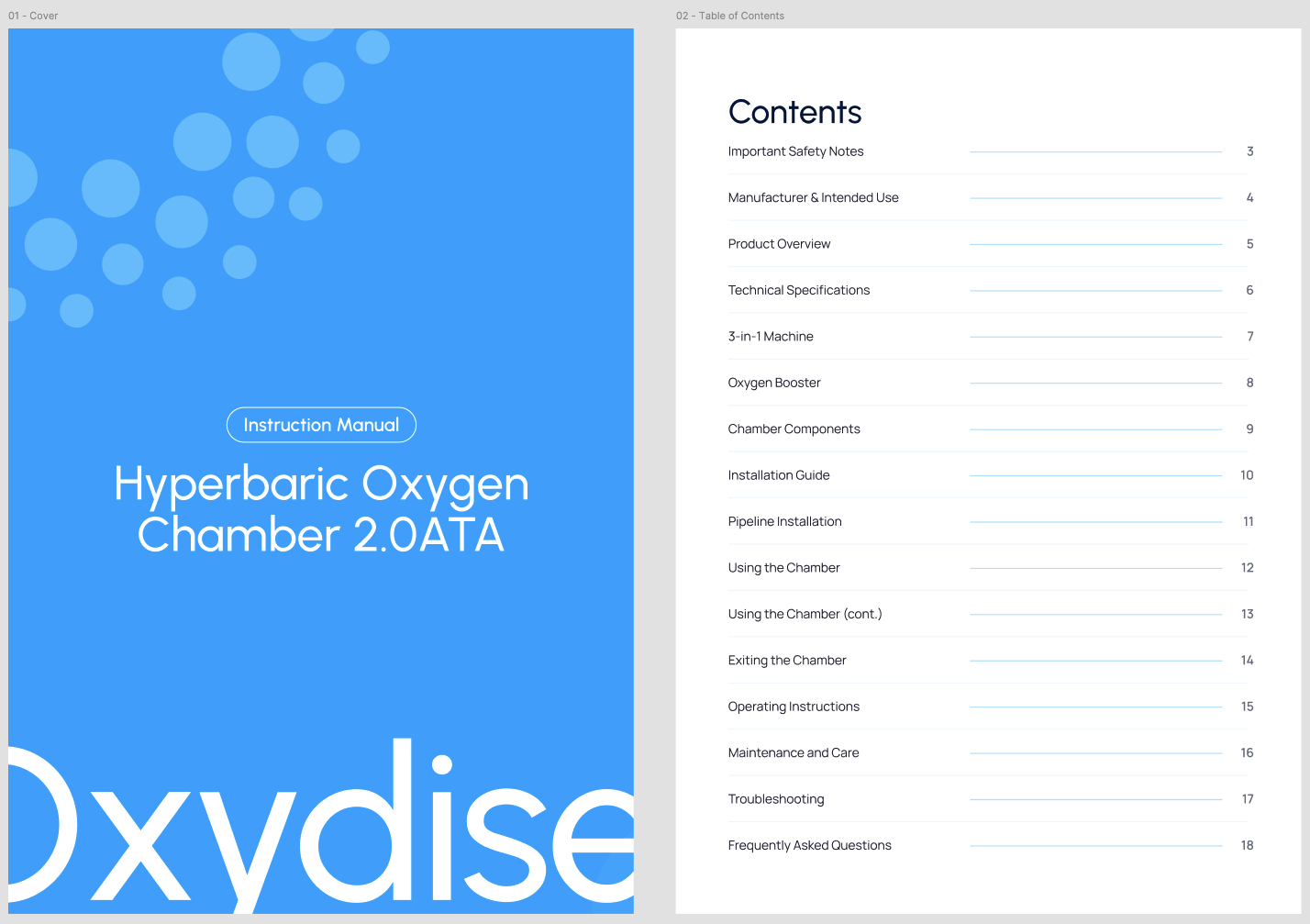
Manuals
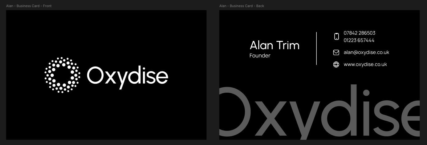
Business cards